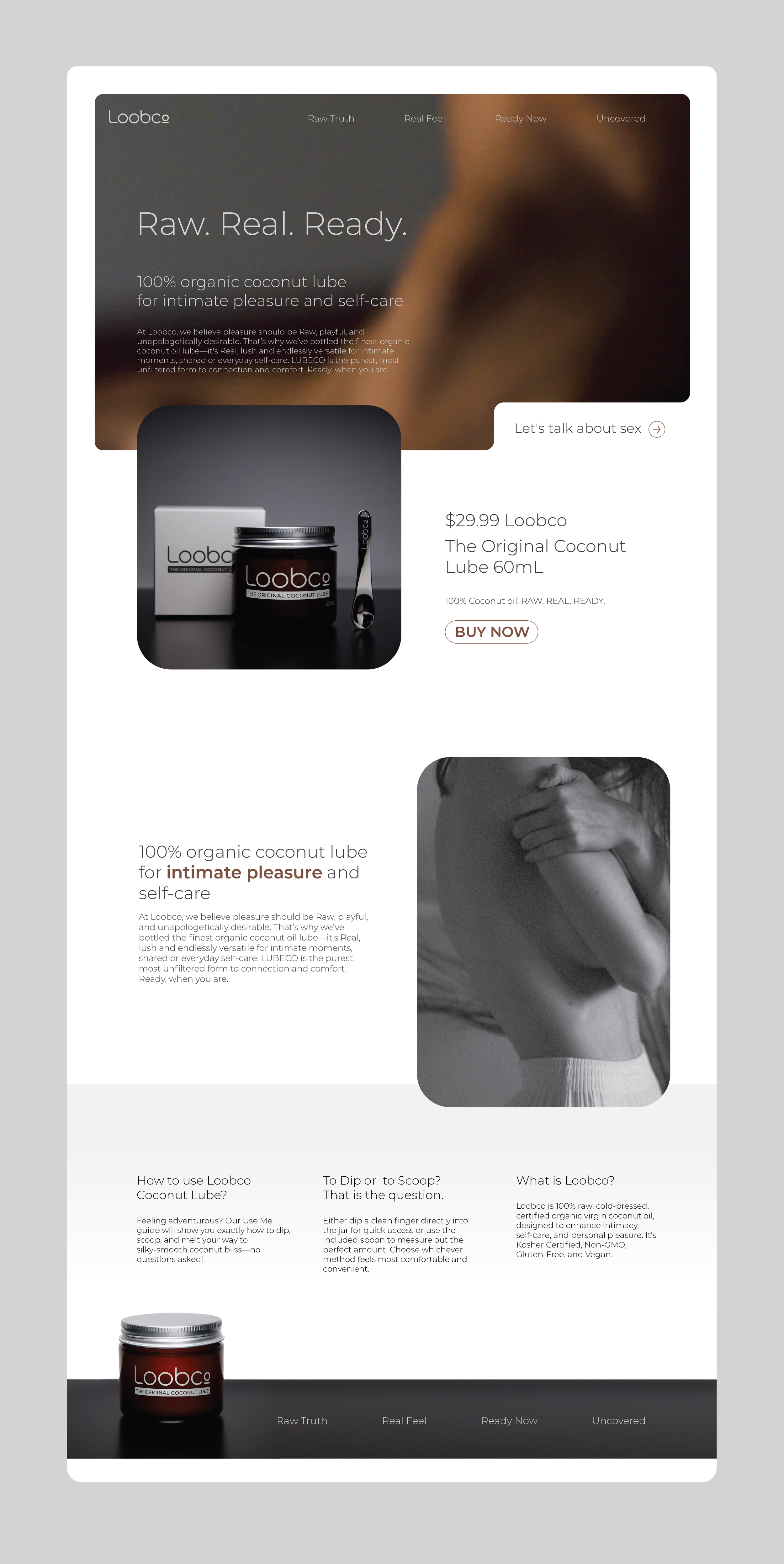
A woman with curly hair lying on her side in bed, with a dark and moody atmosphere. The text overlay says "Raw. Real. Ready." and the logo "Loobe" is in the top left corner.
Web page displaying a product called Loobco, a 100% organic coconut lube. The page features an image of the product container, text about its benefits for intimate pleasure and self-care, price of $29.99, and a buy now button. There is also a black and white image of a woman touching her shoulder.
A color palette featuring five vertical color swatches: dark gray, brown, white, light gray, and very light gray.
A square with two columns and three rows showing the word "Lobco" in various colors and background shades. The top row has black, gray, and white backgrounds with black, gray, and black text respectively. The middle row has brown, brown, and white backgrounds with white text, black, and black text respectively. The bottom row has light gray, dark gray, and white backgrounds with black, black, and gray text respectively.
Graphic design guideline for Loobc logo, including minimum size, clear space, and application size instructions, with diagrams of logo placement and size specifications.
Close-up of a person's eye with detailed reflection, light brown skin, and visible eyelashes.
Unrolled product packaging design for Loobco 100% coconut oil, with sections for ingredients, branding, and barcode, in shades of cool gray and black.
A digital graphic design layout about typography and visuals of women in various poses, with text questions about using Loobco Coconut Lube.

Loobco

Loobco is a brand that specialises in producing a high-quality coconut-based lubricant designed to promote personal wellness and pleasure. As the brand grows and seeks to carve out a unique position in the market, a cohesive and strong visual identity is key to capturing the attention of consumers, ensuring trust, and fostering brand recognition. This project will focus on designing a visual identity that aligns with Loobco’s values of sustainability, purity, and luxury while also appealing to its target market.

Objectives:

  • Develop a fresh, modern, and sophisticated visual identity for Loobco.

  • Ensure the identity reflects the brand’s commitment to using natural, coconut-based ingredients.

  • Appeal to the brand's core target audience—individuals looking for natural, eco-friendly personal care products.

  • Create a recognisable, appealing brand that stands out in the personal care and wellness market.

Deliverables:
Logo Design, Color Palette, Typography, Packaging Design, website and additional print media.

Conclusion: The visual identity for Loobco serve as a crucial step in building a memorable brand that aligns with consumer expectations in the wellness and personal care sector. By focusing on natural ingredients, luxury, and sustainability, the visual identity will communicate these values effectively and help Loobco create a strong presence in the market.