
Client: Sandhurst Timber
City: Bendigo, VIC Australia
year: 2025
Scope: Brand Identity, Logo Design, Visual System, Website Aesthetic Direction
Challenge:
With decades of history and a strong reputation in the construction industry, Sandhurst Timber needed a brand refresh that honoured its heritage while elevating its visual presence. The existing brand felt dated and lacked cohesion across digital and physical touchpoints, including its website and signage.
Solution:
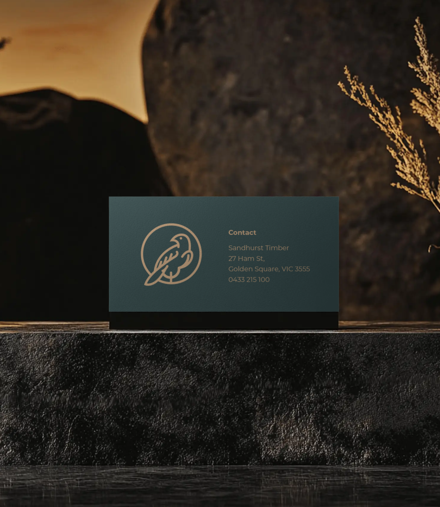
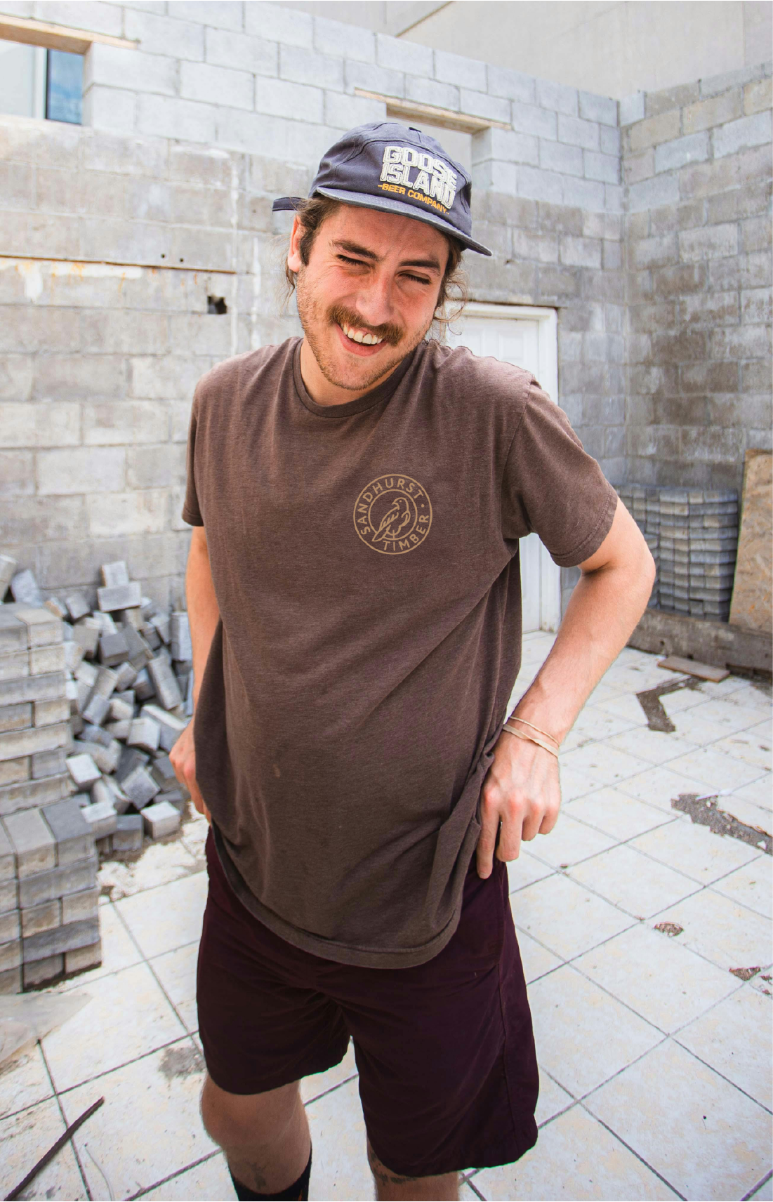
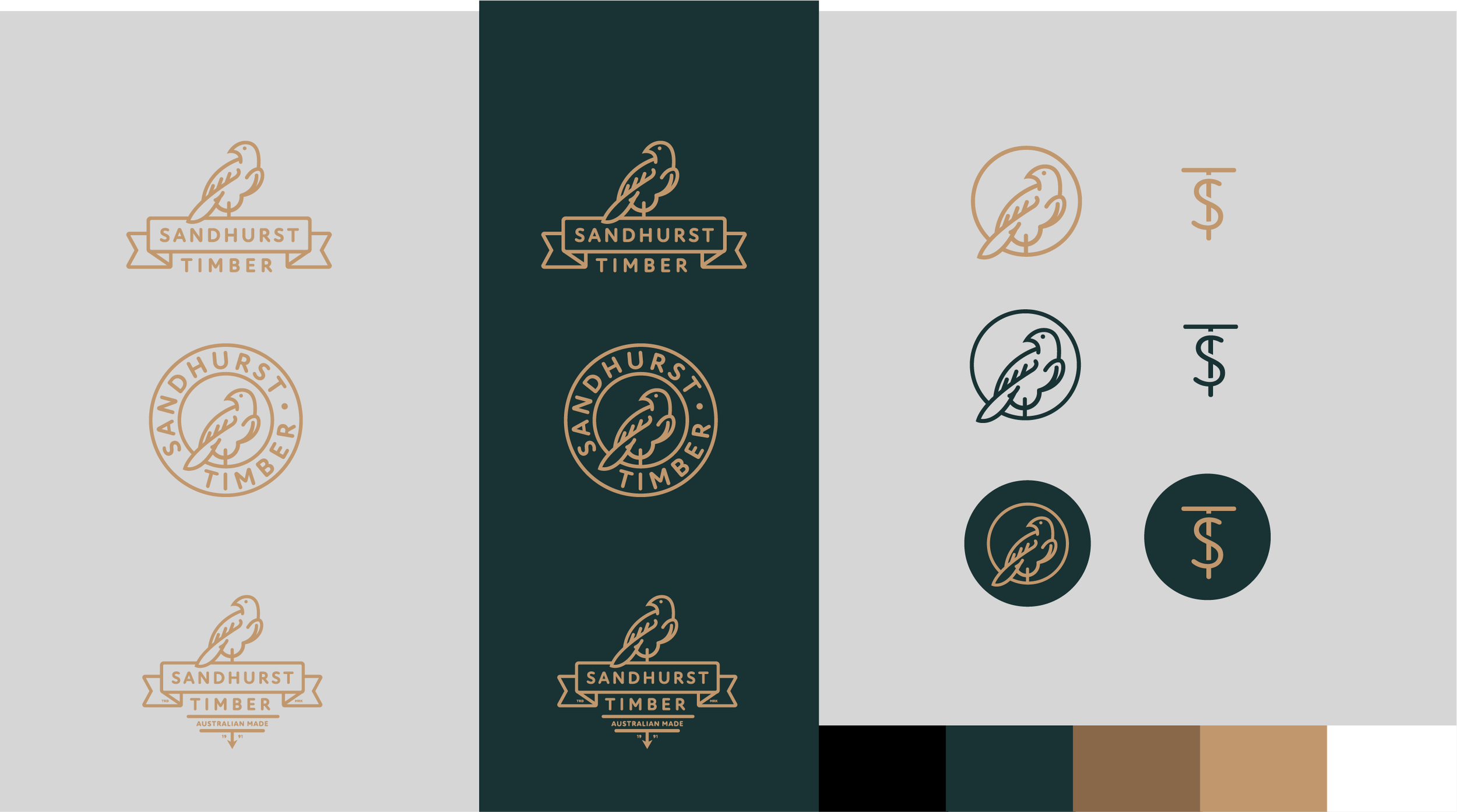
We developed a refreshed brand identity built around strength, reliability, and simplicity. The new logo is clean and bold, featuring a geometric mark inspired by timber stacks—symbolising order, craftsmanship, and structure. A neutral colour palette was paired with earthy tones to represent timber, land, and building materials.
Website Direction:
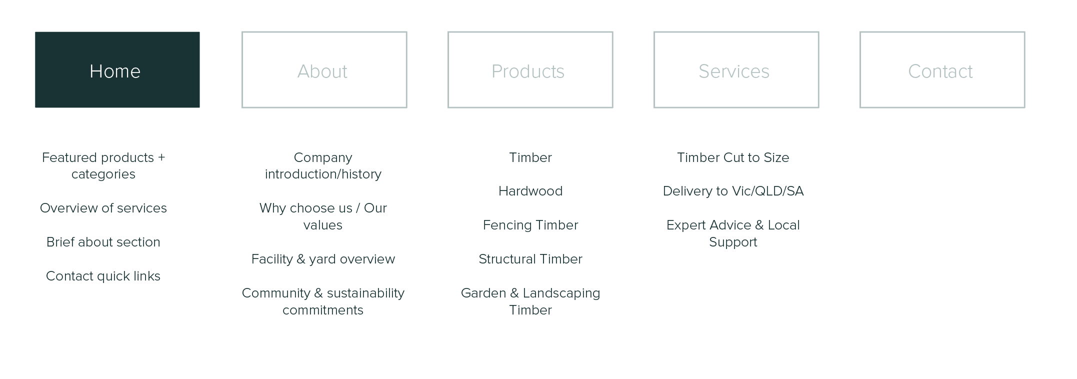
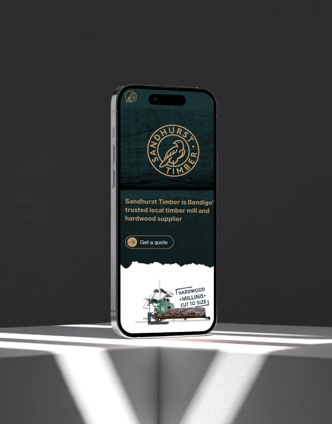
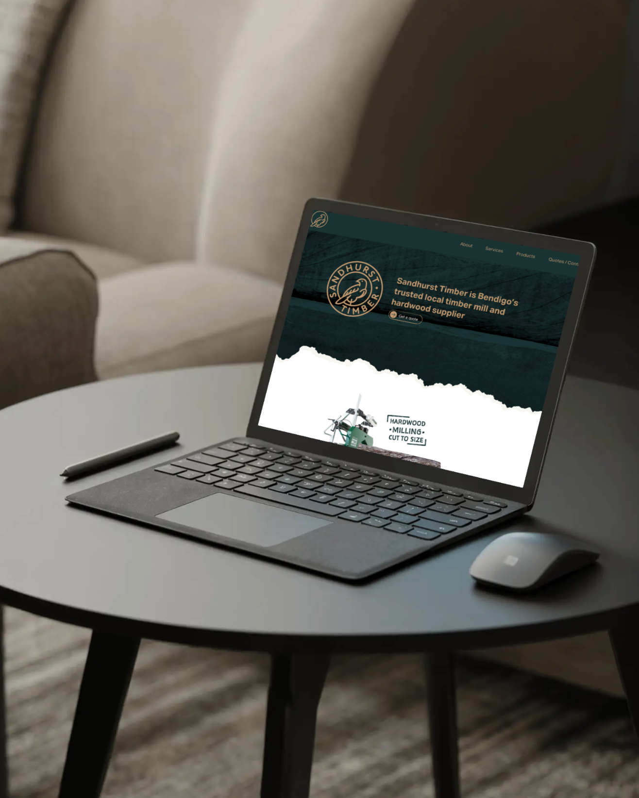
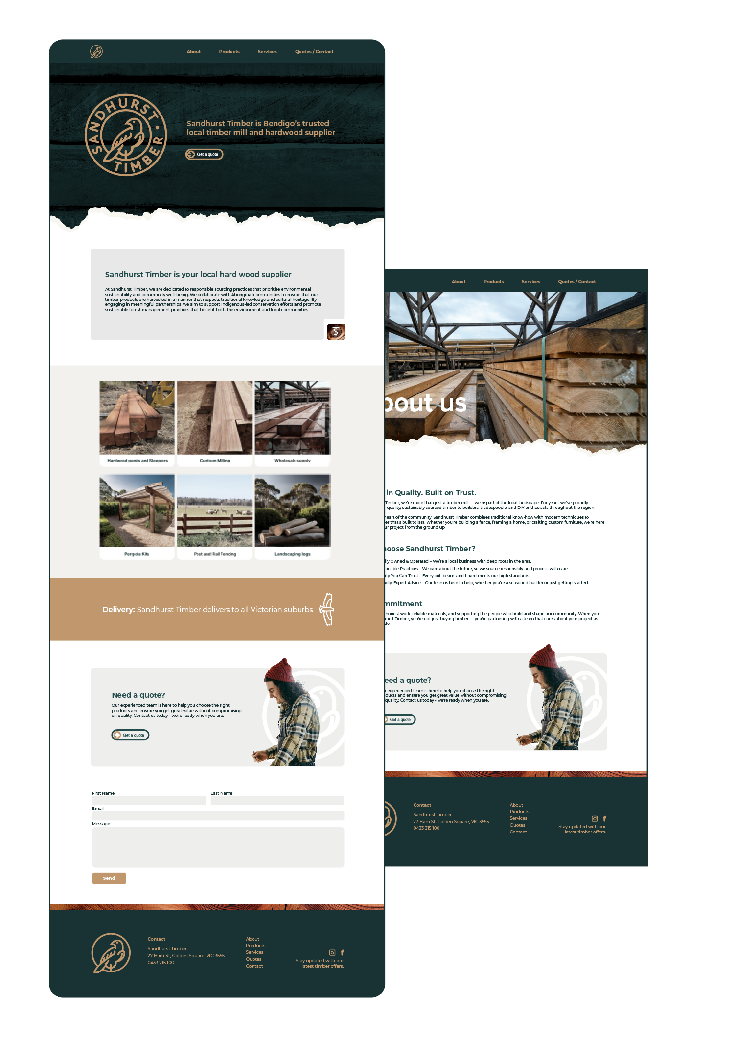
The new website was designed with the user in mind—easy to navigate, informative, and built to showcase the company's full product range and services. Our brand guidelines helped shape the visual consistency of the site, reinforcing trust and professionalism at every touchpoint.
Results
The rebrand has positioned Sandhurst Timber as a contemporary leader in its field, helping the company stand out in a competitive market while staying true to its roots. The unified identity supports future growth, with a timeless look that reflects the brand’s core values: strength, trust, and tradition.
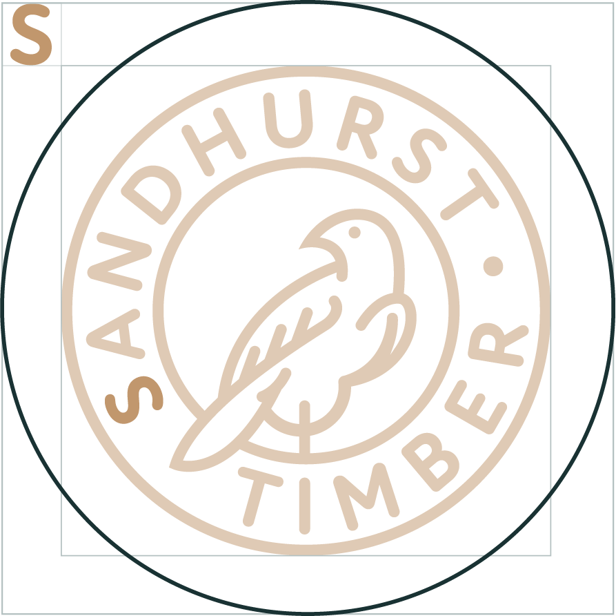
Clear Space / Safe Space
To ensure the Sandhurst Timber logo remains legible and impactful, always maintain a clear space around it. This space protects the logo from visual clutter and ensures maximum visibility.
The minimum clear space is defined by the height of the "S" in the Sandhurst wordmark. No graphic elements, text, or imagery should enter this area.
Clear space = Height of "S"
Use this measurement on all sides of the logo.
Minimum Size
To preserve legibility, do not reproduce the logo below the recommended minimum sizes.
Print: Minimum width of 25 mm
Digital: Minimum width of 200 px
Using the logo below these sizes may result in loss of detail and compromise brand recognition.
Website:
The new website was designed with the user in mind—easy to navigate, informative, and built to showcase the company's full product range and services. Our brand guidelines helped shape the visual consistency of the site, reinforcing trust and professionalism at every touchpoint.
Site map: